THE BRIEF
IQ Interlayers is a company specialising in glass solutions, know-how, special interlayers, security glass and switchable glass. It is also the sister company of the Glass Technique Ltd.
Their clients are mostly architects, interior designers but also other glass companies that are interested on bespoke products and solutions. IQ Interlayers will be launching in Germany, London, UAE and Thailand.
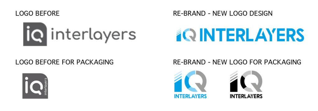
We have been appointed to re-brand their existing logo into a contemporary and professional visual appearance.
STRATEGY
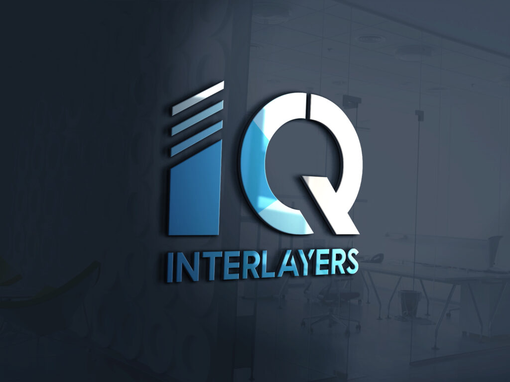
The concept was based on the glass production. In this industry, the initial stage of the glass production is to cut a big sheet of glass into different shapes.
The shapes can create different colour opacities/translucency. The idea of the letter ” I ” was to show the initial production stage.
Since the company is also specialising on interlayers, we wanted to keep this element. The letter “Q” is separated into two parts. The left part is showing the translucency levels and the right part of the letter “Q” is showing the mirror effect, the hammer and also the switchable glass.

RESULTS
A contemporary, new professional logo. Our client was really pleased with the result and he will be using the new logo in his existing website, soon.
KEY SERVICES
- Consultation
- LOGO DESIGN
- COLOUR SEPARATION FOR SCREEN AND PRINTING

